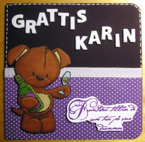
Another graduation card

One of my friends from high school is graduating from medical school tomorrow and I decided to make her a card and combine it with the Less is more week 49 challenge which is “Predominantly Purple”. I love purple, I really do! But I tend not to make my cards purple so it was a bit of a challenge, as it always is! I’m not too satisfied with the card but at least I took some time to craft which I’ve barely done the last few months.

The sentiment says “The future belongs to those who believe in their dreams.” Classic I must say, it was this sentiment or the one I used the last time “A walk of a thousand miles always starts with one step”. I asked my friend Simon for some help and he voted for the dream sentiment and I must admit it was the one I felt was most right too. I wish I had a more fitting stamp for a future doctor but I guess you’ll never have enough stamps?

Anyway, here’s the card!

Sorry for the crappy picture, my camera ran out of batteries.. again! The dark background is very dark violet and the card has a slightly more red tint than it looks on the picture.
The Christmas cards of 2011

So I made a few cards last Christmas too, of course! I even made a few more than I usually do and surprised one or two friends. They were very happy! Unfortunately I can’t remember who got which card since I randomly put one in each envelope, I don’t like to choose. Maybe I should go for one design and ten copies this year? Problem solved!

Here are the cards I started in September but didn’t finish until December.. sigh! I’ve had such lack of inspiration lately and it’s really annoying but hopefully this year will be better.

I went nuts with warm embossing and the last card is the one I’m most satisfied with. I embossed the stars with white powder and used distress stain to color the background. I used the distress stain weathered wood from Tim Holtz on light blue cardstock.
The brown card has the recipe for gingerbread cookies but in Swedish. I practiced using my ProMarkers for coloring the stamps and it’s getting better and better, the techniques differ a bit from ordinary aquarelle but once you get the hang of it it’s a lot less wet and messy! I do believe the coloring is much easier if I stamp on aquarelle paper rather than plain paper or cardstock. I got the feeling the aquarelle paper dries somewhat slower which makes it easier to get the color even, but maybe it all depends on technique. I will give cardstock another try one day when I’m even better with using my ProMarkers!

Another card

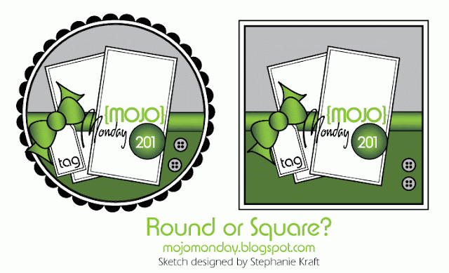
I’ve spent my last vacation on doing things I like, such as baking, cooking and crafting. I like to use different challenges for inspiration when I’m making cards and this time I decided to enter the Mojo Monday challenge 201. The sketch to follow looks like this:

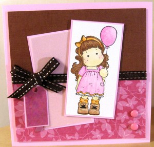
I decided to make a girly card with lots of pink!

Whenever I decide to give it away or anything I’ll put some text on the tag and as usual the stamp is colored using aquarelle pens. Paper from Slöjd-detaljer, Panduro and the lovely paper pad Desert Blooms, ribbon from Panduro and the stamp is from Magnolia.


Theme 62: Water

Tried to make some cards this weekend and it didn’t go too well. The work went slow and I’m not very satisfied with the results. Two cards left half finished and one very simple and maybe boring card for the LIM week 22 challenge. Oh well, at least it’s relaxing to craft.

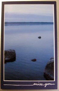
The card feels sad so it became a “miss you”-card. The picture is from Norrland and I do miss being there. The challenge was to create a card using shades of blue. Here’s my entry:

I’ve almost forgotten about my 123 themes challenge. Luckily this one fits perfect for the Water theme!

Midsummer challenges

Svensk Scrapbooking has a midsummer crop this year and I decided to enter a few of the challenges. I was hoping to be able to make it into all 13 but I don’t have the time or inspiration, I just want to relax and enjoy my free weekend. I did manage to make three cards but only for two challenges. The first one was to make a cards shaped of an ice cream. The text means “Something sweet and cool in the heat”.

The second was to make a card with the colors green, pink and turquoise. I made two cards, having a hard time to decide which one to send in. I think it will be the second one eventhough the picture is crappier. The card is less blue than it looks..

An elegant birthday card

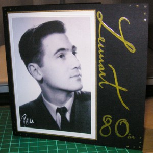
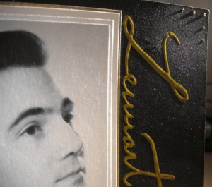
My grandfather turned 80 a few days ago and I made him a card. It took me a while to get the card finished, it’s not very easy to make a card that looks elegant and classy but that was the feeling I was looking for. And I just had to use gold somehow. I found a sixty years old card of him (I also have a similar on my grandmother) that I like very much, it’s elegant and I think he looks like a movie star from the 50’s or something. I decided to use it in the card with some golden details.

He liked it a lot and commented the handwriting, this time I actually wrote it myself and it took some training to get it to look decent but I’m very happy with the result!

I used embossing on the text and the frame around the picture and some glitter glue dots in the corners.