Cardmaking weekend

It’s been a quite crafty weekend I must admit. I made three cards using up a lot of time, as usual! I often find myself spending most of the time just figuring out what to do and what paper or stamp to use. This weekend I found a layout I liked a lot and thought would be fun to make a card of. It took me several hours to come up with something following the sketch! So while pondering I made two other cards, one of them for my brother as his birthday is tomorrow!
I’ll just write the challenges used above each card to make it a bit easier to read.

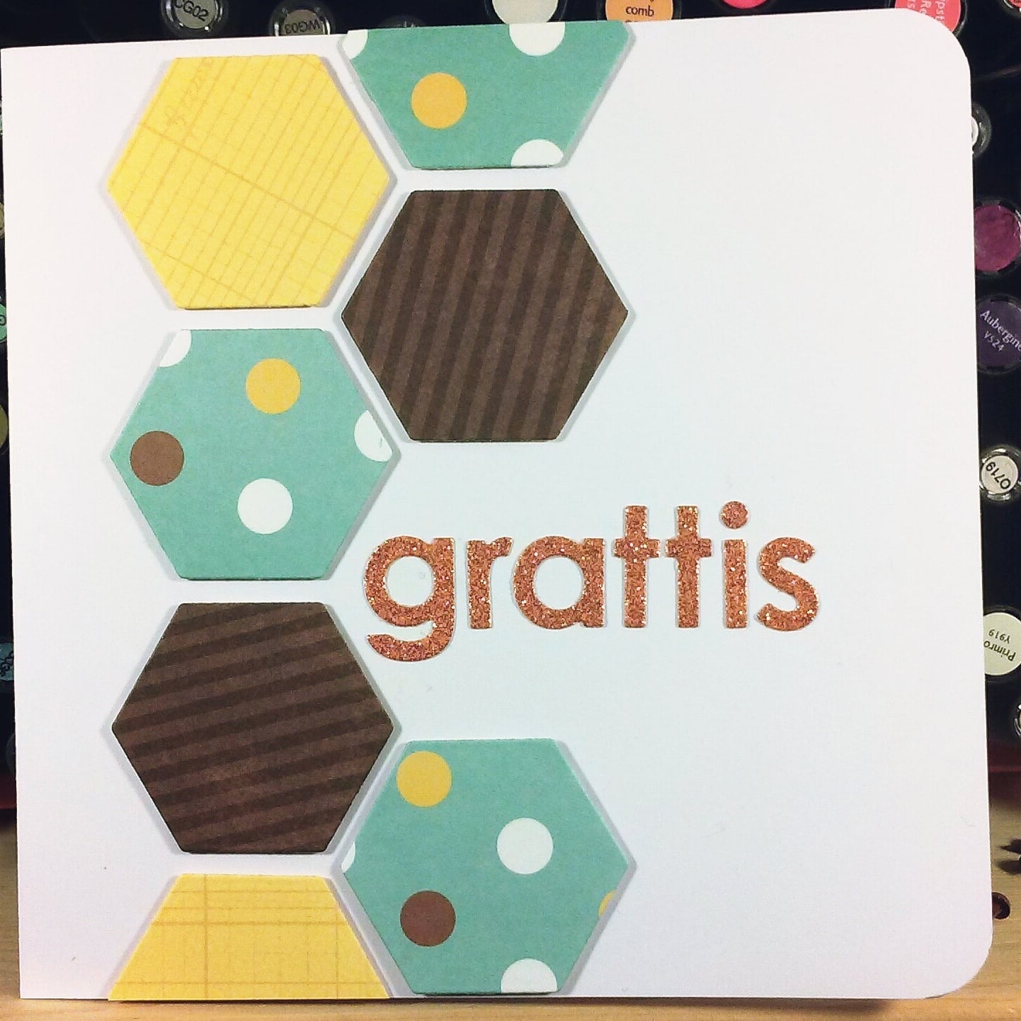
Seize the birthday – anything goes with the option to use washi, which I did not do. I did however get to use my new hexagon die jenandtricks got me from UK! <3
The paper used is a mixture of some scraps, don’t rememeber the brandexcept for the brown (Echo Park) and the glittery one (DCVW). I cut out the letters using my Memory Box alphabet dies, which I love!

image

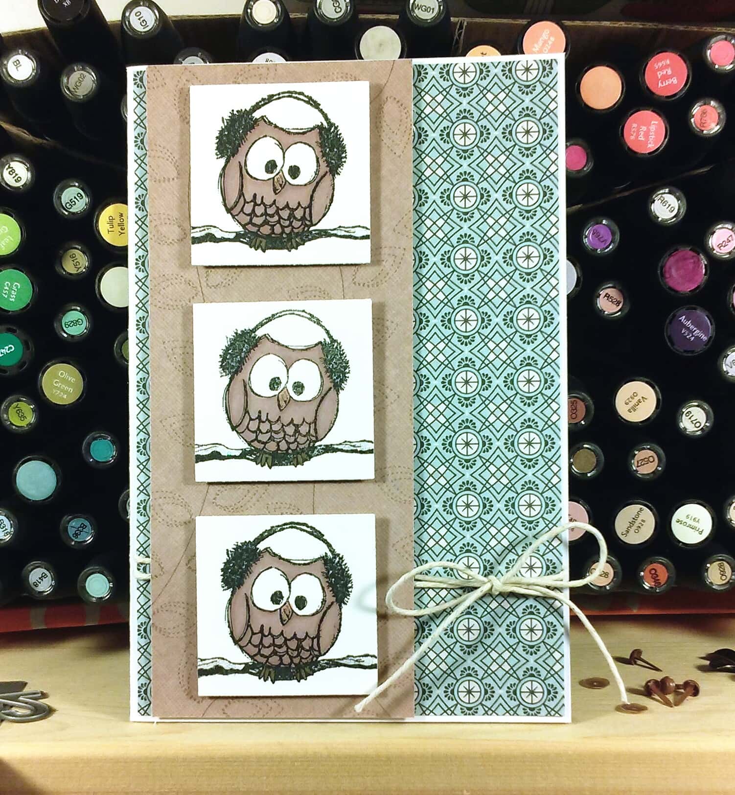
For this card I was inspired by Mojo Monday #369 – layout, Passion for promarkers #271 – add some sparkle. I love promarkers #243 – three of a kind. Once I saw the sketch I got an idea for the card. The papers are from Basic Grey – Persimon and First Edition – New Leaf.

image

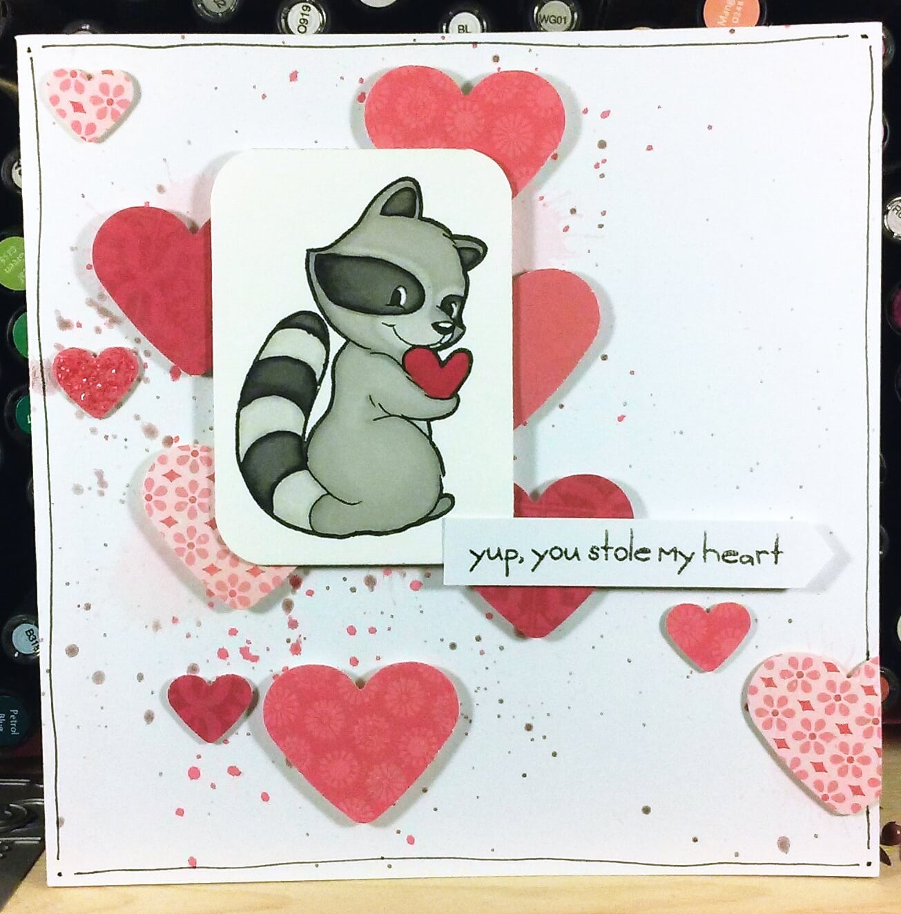
And for this happy card; Veckans skiss # 38 – layout. I colored the stamp from Some odd girl and messed with colors on the cardstock. Punched some red and pink hearts from my scraps and I even got to use my new pearl mists I found on a sale, woho!
image

Saturday cards

So I spent a few hours in my crafting closet today again with a few challenges in mind.
Here are the results and the challenges:

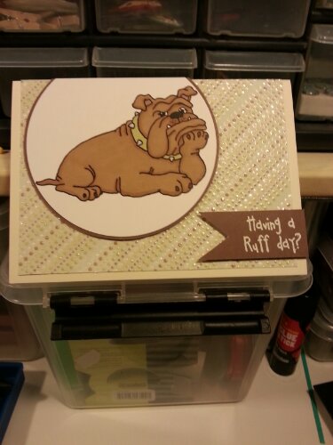
I love promarkers: Four legged friends
Sweet Sunday sketch challenge

image

image


Mojo Monday #281

image

image


Casual Friday CFC 91 – Hi ho silver

image

image


image

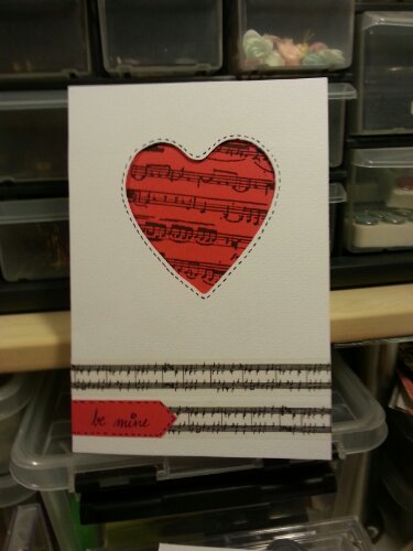
yet another Valentines card

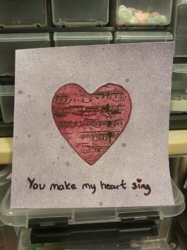
Yet another experiment in the theme music and hearts.. I just couldn’t stop.. or succeed ;)
And I hate taking pictures of red, it’s always hard to take good photograph if there is too much red areas.
image

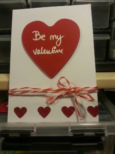
Another valentines card

I decided to enter with two cards for the 2 sisters challenge this week, here’s the second one!

I played around a bit with negative punching and using 3d-tape for the big heart to make it stand out a bit. Since I filled the smaller hearts with red glitter it doesn’t show the negative effect very well.

wpid-20130209_184320.jpg

Be my valentine

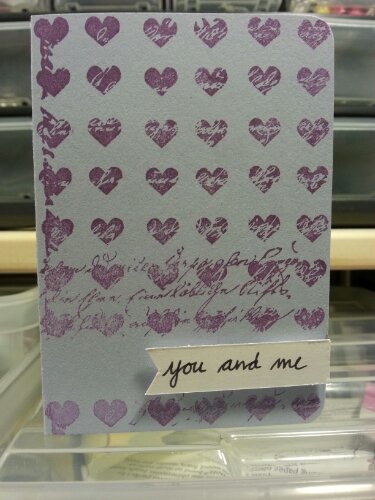
I was a bit crafty today and managed to create a couple of cards all with a valentine’s theme, so odd this time of the year, he he.
I tried a lot of different and, to me, new techniques with masking and coloring using spray. And I used my new flexmarkers to color a bunch of stamps. That’s always a lot of fun, and it’s even funnier now when I’ve reorganized them a bit to make the access easier. I do love my promarker wallets but I find them handy for travelling or when I have a huge space to color, which I rarely have of course. I’ve spent most of my day by my closet now and I still have a lot of inspiration left although I’m getting exhausted so I might just relax for the rest of today.

image

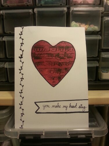
This card is that one card where nothing goes your way. The masking ruins the stamping because it’s a tiny bit higher than the card, it also ruins the coloring since it’s not properly adhered, my bad I know. After coloring and stamping you notice two things, the tape is too sticky and leaves marks and the heart is not centered even though you tried to make sure it was, which leaves the left side empty. Since it was supposed to be a one layer card I’m left with few options and I found a decent stamp. And of course I get ink on my fat fingers and leaves black marks here and there (it was possible to remove them enough to barely see them, phew). Stressed by the ink marks the stamping went bad (at least for a perfectionist).

With most of the mistakes covered I jump in to writing my sentiment and it’s leaning.. and I decide to try to cover it up with my planned fake banner and I manage to draw a very leaning line, leaning in the other direction than the text of course and the bottom line was decent of course. So I have to draw thicker lines, miss the thin line and have to make a shadowy look to cover that up. After all these mistakes I’m surprisingly satisfied, it does look quite OK or I’m just too lazy to make a third round (Yes the purple card below was supposed to be the first one and then I remembered I had to have white space on the card for the LIM challenge).

image

image

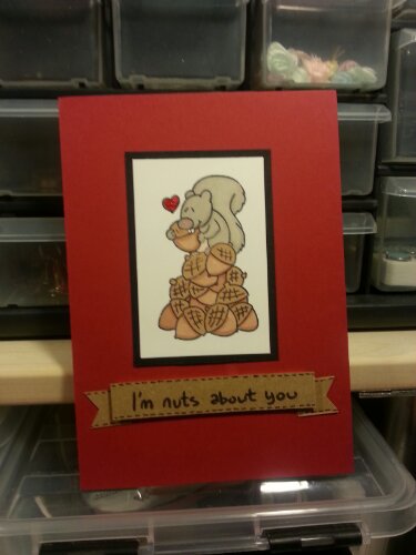
I love this stamp, it’s super cute! I seem to love stamps with funny animals easier than others (I have another favourite with a moose on, adorable!). I made it for the 2 sisters challenge this week.